Step-by-Step Guide to Creating & Analyzing Cohorts
Core Cohort Types
-
Customer Journey: Track how customers flow through lifecycle stages and transition between segments over defined time intervals.
-
Funnel Analysis: Visualize step-by-step conversion rates and drop-offs through a defined sequential path.
-
Customer Repeats: Measure customer retention and repeat engagement over rolling time windows (Month 0 to Month 11+).
Cohort Type 1: Customer Journey
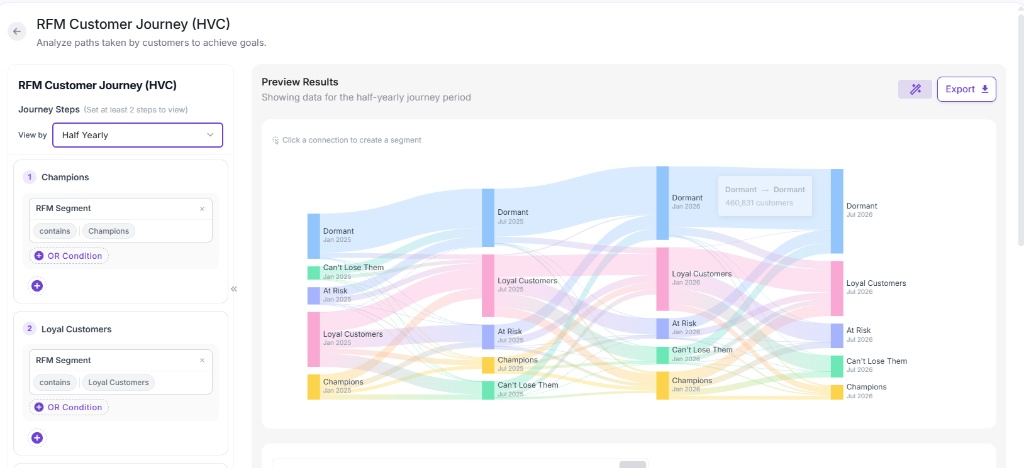
The Customer Journey cohort helps you analyze multi-period customer flow (such as moving from Champions to At Risk) using interactive Sankey diagrams.
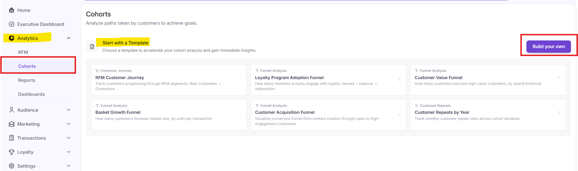
Select Build your own from the top right or start from a pre-built template.
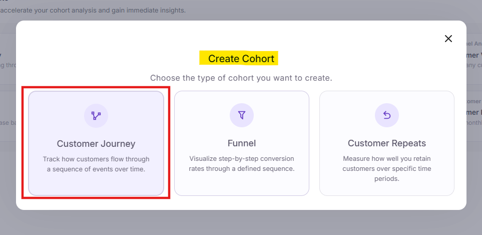
In the modal prompt, click Customer Journey to analyze how customers flow through a sequence of events over time.
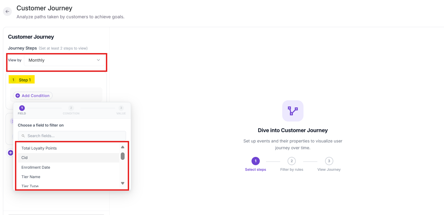
Set the View by time granularity (e.g., Monthly, Half-Yearly, Yearly) and click + Add Condition to define filtering rules (e.g., RFM Segment, Loyalty Points, Tier Name).
Click on the Save & Generate to generate the cohort. Please note, it will take 15 minutes to create a cohort.
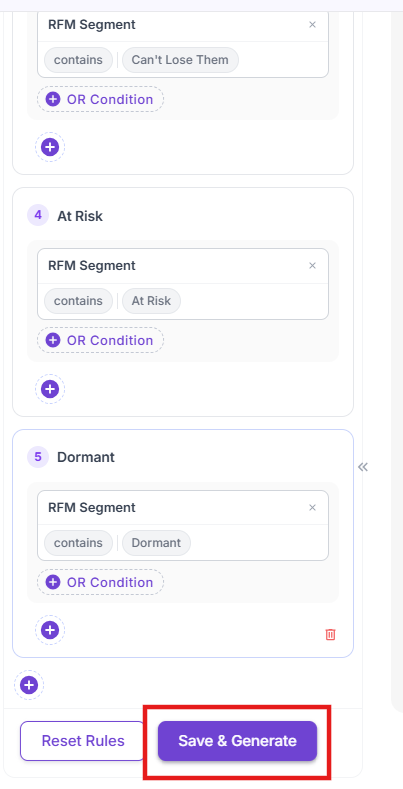
Once steps are defined, the interactive Sankey diagram displays cohort movements across the selected time periods.
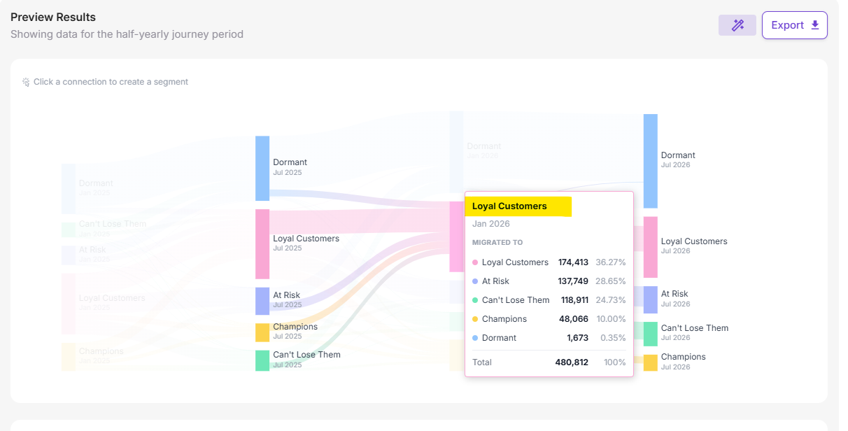
Hover over any specific block or connecting node to reveal detailed transition statistics, including total customer volume, destination breakdown, and transition percentages.
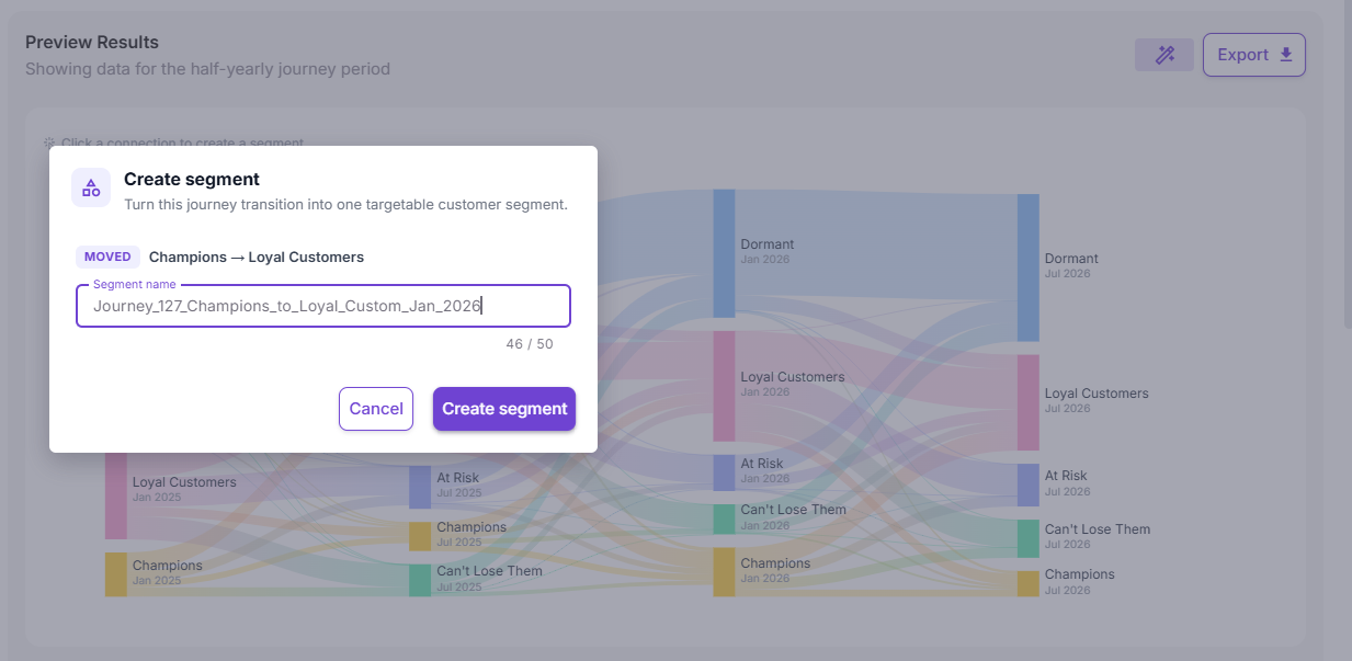
Click any flow connection or use the tabular data view to convert transition paths directly into targetable audience segments.
-
Log in to your OptCulture workspace.
-
Click the Home / Dashboard icon or navigate to the Analytics menu on the left sidebar.
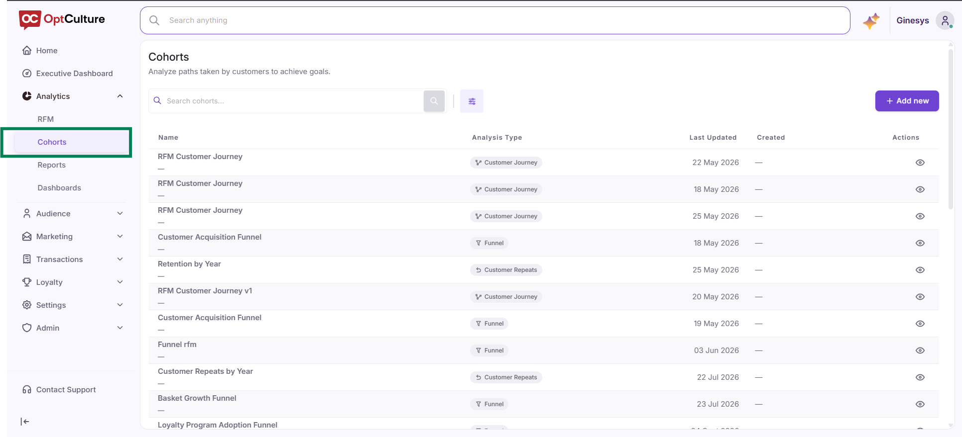
Step 2: Defining and Customizing Views via Dashboard Builder
-
Click the Edit Dashboard icon (pencil symbol) at the top-right corner.
-
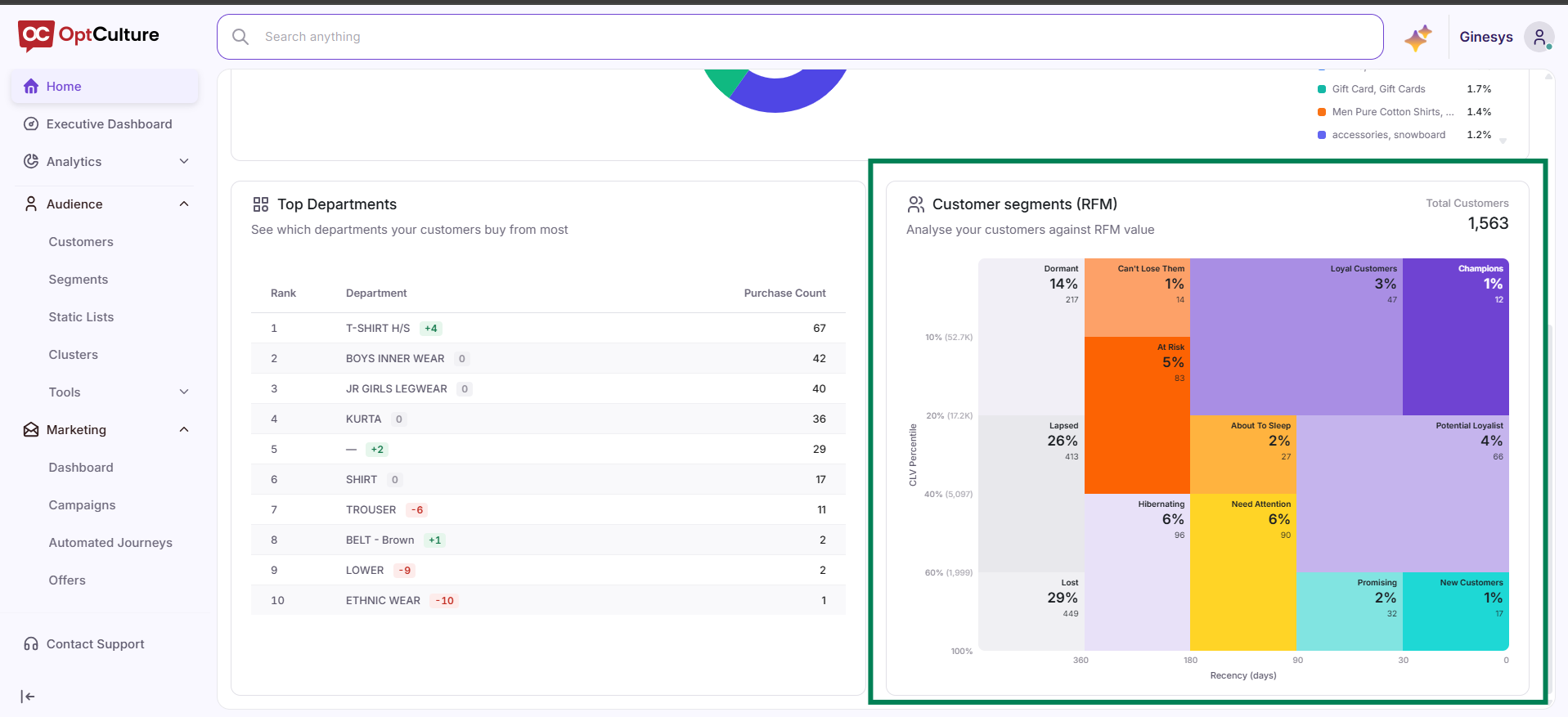
Organize your view to prioritize cohort metrics, including RFM Customer Segments and Top Departments.
-
Save your custom layout to preserve your analytics dashboard configuration.

Step 3: Evaluating Cohort Purchasing Trends Across Departments
-
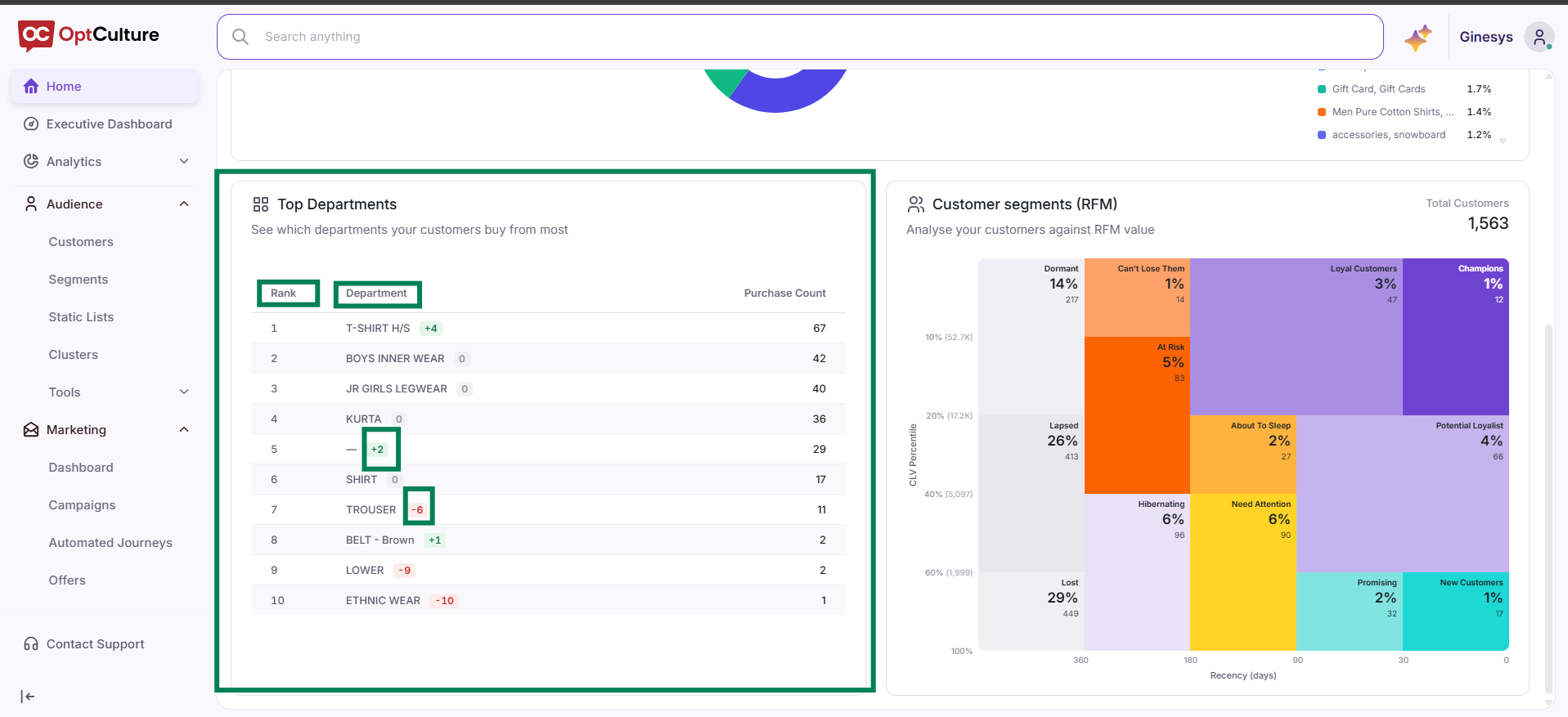
Locate the Top Departments widget.
-
Analyze purchasing volume by category to identify which product departments drive repeat behavior within specific acquisition windows.
-
Observe rank movement tags (e.g., green
+2or red-1) to monitor shifting product preferences over 30-day reporting windows.
Step 4: Tracking Cohort Progression in RFM Segments
-
Go to the Customer Segments (RFM) treemap view.
-
Review customer volume distribution across groups such as Champions, At Risk, and Need Attention.
- Click or hover on a segment block to analyze cohort member counts and determine which groups require immediate re-engagement campaigns.