Accessing and Understanding the Reports
This report is divided into two main tabs:
-
Customer Visits: A high-level visual dashboard of visit frequency, retention, and timing.
-
Customers Sales: A granular, row-by-row table of every individual transaction.
Access and Filter the Report
Step 1: Navigate to the Report
Step 2: Apply Filters
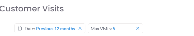
At the top of the report, you will find filters to customize your data. CommonThe filterstwo include:most important are:
-
analyzeDate Range:Dates: The time period you wish toanalyze.(e.g., - "Previous
Store/Zone:12To isolate data for specific locations.months"). -
Max Visits: This
importantfilter controls the depth of the Customer Visits Funnel.(e.g.,Inathevalueexample,of"5"'3'is selected, so the funnel will show thefunneldrop-off from Visit 1->through Visit2 -> Visit 3).5.
Understanding the "Customer Visits" Tab
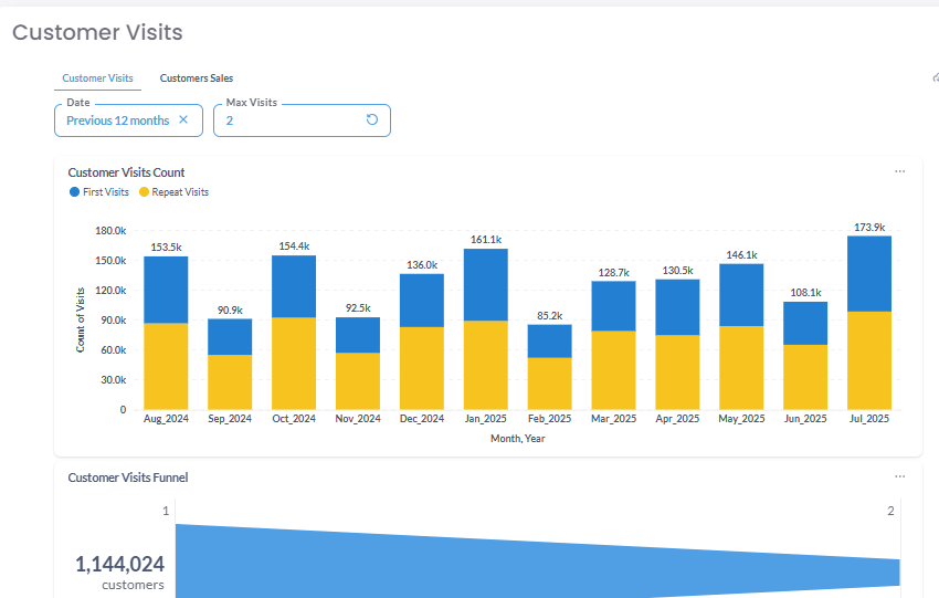
This tab provides a visual overview of your customers' visit frequency and repeat behavior. It typically contains three main charts:
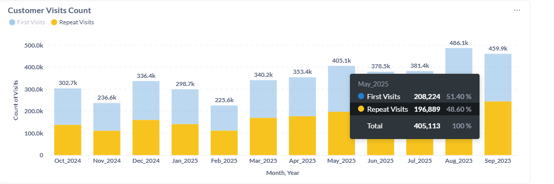
A. Customer Visits Count (Stacked Bar Chart)
This stacked bar chart displays a month-by-month breakdown of your total visits, split into two key groups:
-
First Visits (Blue):
(These are newcustomers)customersandmakingRepeattheirVisitsvery(returningfirstcustomers).purchase. Thishelpsisyouavisualizekey indicator of your customer acquisitionandsuccess. -
Repeat Visits (Yellow): These are returning customers. This is a key indicator of your customer retention
trendsandthroughoutloyalty.
How to Read This Chart: In the year.example, August 2025 had the highest total visits (486.1k), with a healthy mix of new and repeat customers. February 2025 had the lowest visits (225.6k), but you can see that the proportion of repeat visits was still significant.

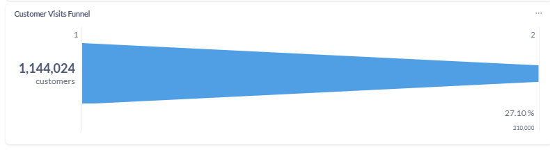
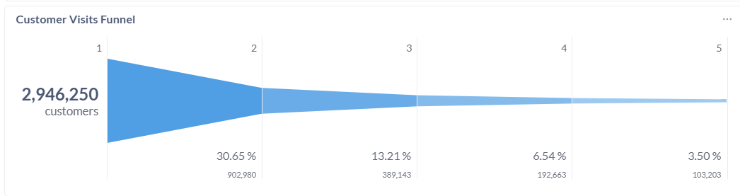
B. Customer Visits Funnel
This funnel visualizes your customer retention rate between visits. ForIt example, it might show that ofshows the 1,144,024percentage of customers who madereturn for a first2nd, 3rd, 4th visit, 310,000and (orso 27.10%)on, based on your "Max Visits" filter.
How to Read This Chart: In the example:
-
Visit 1: 2,946,250 customers made their first visit.
-
Visit 2: Of those, 902,980 returned for a second visit. This is a 30.65% retention rate from visit 1 to 2.
-
Visit 3: 389,143 customers returned for a third visit, and so on.
This funnel is the most direct way to measure of your ability to create a repeat customer.
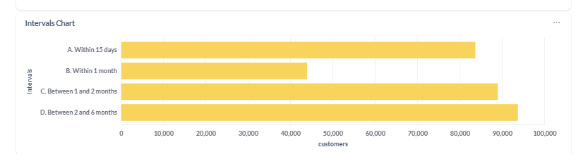
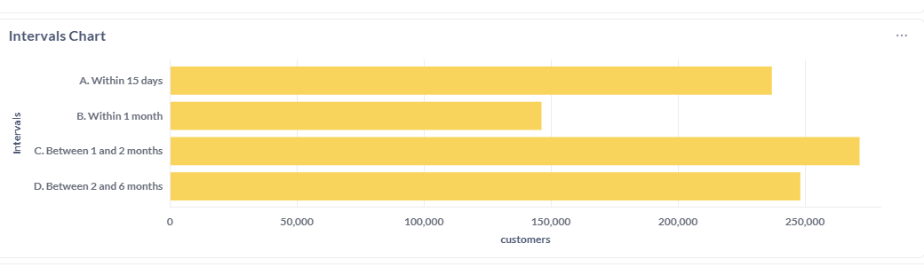
C. Intervals Chart
This chart shows the average time it takes for customers to make a repeat visit. It breaks down the number of customers who return within specific timeframes,timeframes.
How asto "WithinRead 15This days,"Chart: "BetweenThis 15is andcrucial 30for days,"understanding oryour natural purchase cycle. In the example, the largest group of customers (over 250,000) returns "Between 1 and 2 months." This tells you that scheduling a "we miss you" campaign around the 45-day mark would be highly effective, as it targets the largest segment of your audience at the exact time they are naturally thinking about repurchasing.
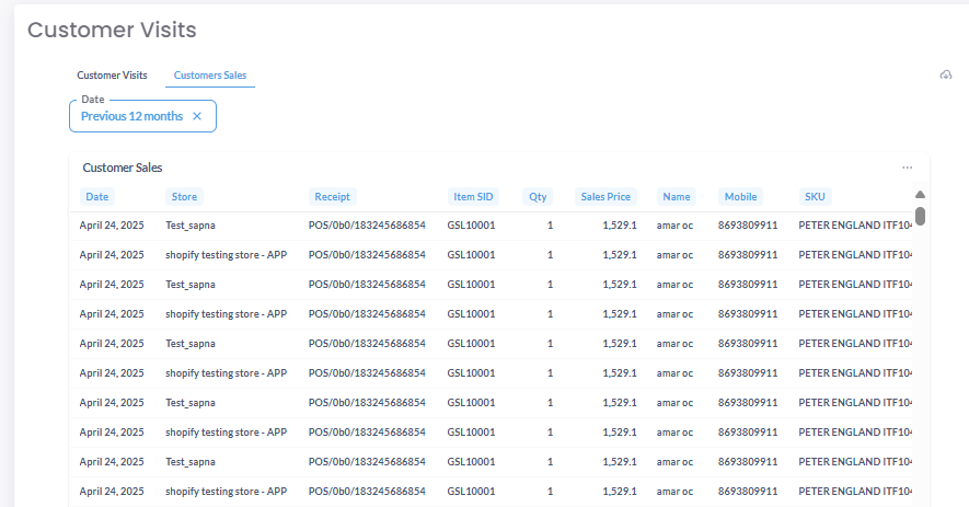
Understanding the "Customers Sales" Tab
This tab provides a granular, transactional view of all individual sales that occurred within your selected date range.
Sales Data Table
The table lists every single transaction, with columns for customer details, date, amount, store, etc. This view is perfect for drilling down into specific sales data to investigate trends you spotted on the main "Customer Visits" tab.