
Accessing and Usage of Report
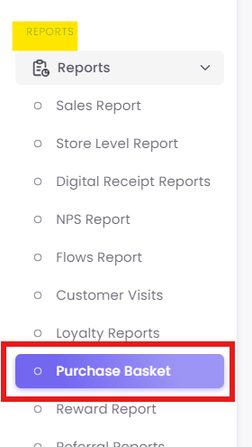
Step1: Navigate to the Report
Step 1:2: Analyze Product Affinity (Affinity Map Tab)
This is the first tab, which answers the question: "What products are frequently bought together in the same transaction?"
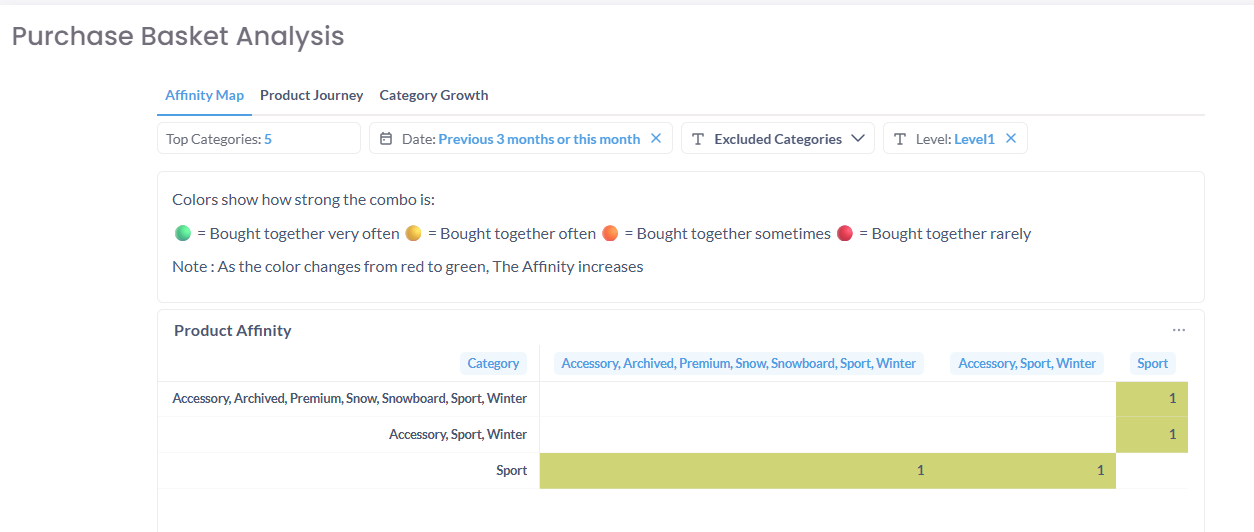
Caption: The Affinity Map tab, showing the color legend and the Product Affinity matrix.
This screen is broken into two parts:
-
A. How to Use (Filters):
-
Top Categories: Select the number of top-selling categories you want to analyze (e.g., 5, 10, 20).
-
Date: Choose the time period for the analysis (e.g., "Previous 3 months or this month").
-
Excluded Categories: Remove non-product categories (like "Shipping Fees") to get a cleaner analysis.
-
Level: Set the category hierarchy you want to analyze (e.g., Level 1 = "Apparel").
-
-
B. Interpreting the Report:
-
Color Legend: This key explains the "combo-strength":
-
Green = Bought together very often
-
Orange = Bought together often
-
Red (light) = Bought together sometimes
-
Red (dark) = Bought together rarely
-
-
Product Affinity Table: This matrix plots your categories against each other. The color at the intersection reveals their relationship. For example, if the "Sport" row and "Accessory" column intersect at a green square, it means those two categories are bought together very often.
-
Step 2:3: Visualize the Customer Journey (Product Journey Tab)
Click the Product Journey tab to answer the question: "After a customer buys from Category A, what category do they buy from on their next visit?"
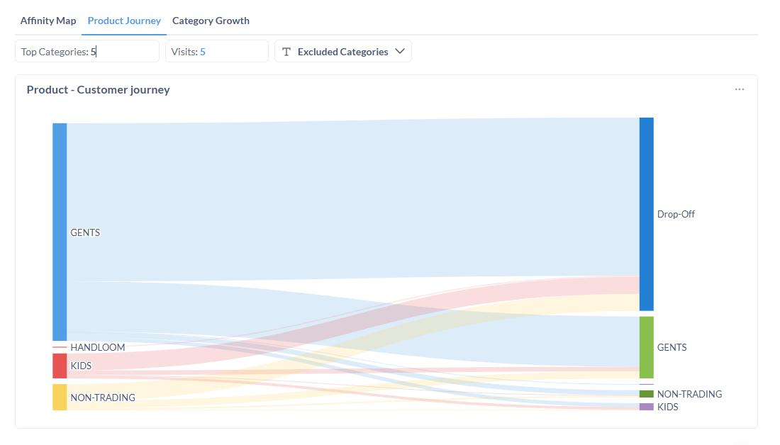
Caption: The Product - Customer journey tab, showing a Sankey diagram of purchase paths.
A. How to Use (Filters):
- Top Categories: Select the number of starting categories for the journey.
- Visits: Define the number of purchase visits to analyze (e.g., "5" visits).
- Excluded Categories: Remove irrelevant categories from the analysis.
B. Interpreting the Report (Sankey Diagram):
- Left Column (Initial Purchase): This represents the first purchase in the journey (e.g., "GENTS," "HANDLOOM," "KIDS").
- Right Column (Next Purchase): This shows the category of the second (or subsequent) purchase.
- Flows: The colored streams connect the initial purchase to the next one. The thicker the stream, the more customers made that specific journey.
- Drop-Off: This is a critical metric. The large "Drop-Off" bar on the right shows the percentage of customers who did not make a subsequent purchase from any category within the analyzed timeframe.
Step 3:4: Track Category Performance (Category Growth Tab)
Click the Category Growth tab to answer the question: "Which product categories are growing or shrinking compared to last year?"
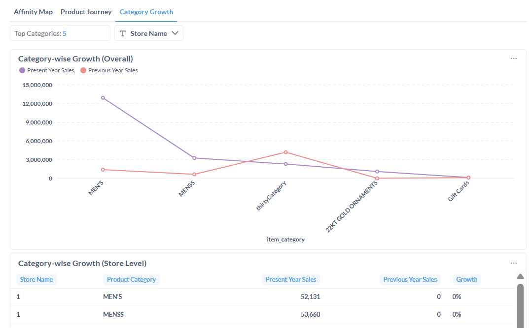
Caption: The Category Growth tab, showing overall trends and a store-level data table.
A. How to Use (Filters):
- Top Categories: Select the number of categories you wish to compare.
- Store Name: Filter the entire report to see data for one or more specific store locations.
B. Interpreting the Report:
- Category-wise Growth (Overall): This line chart is your primary tool for spotting trends.
- Purple Line: Represents "Present Year Sales."
- Red Line: Represents "Previous Year Sales."
- You can quickly see if a category (like "MEN'S") is outperforming the previous year or if another (like "thirtyCategory") is underperforming.
- Category-wise Growth (Store Level): This table provides the raw data used in the chart, broken down by store. It shows the exact Present Year Sales, Previous Year Sales, and the resulting Growth percentage.