
Accessing and Understanding the Reports
Access and Filter the Report
Step 1: Navigate to the Report
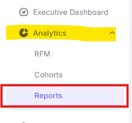
Step 2: Navigating the Dashboard Tabs
The report is divided into five distinct tabs to give you a 360-degree view of your customer behavior.
1. Customer Visits Tab
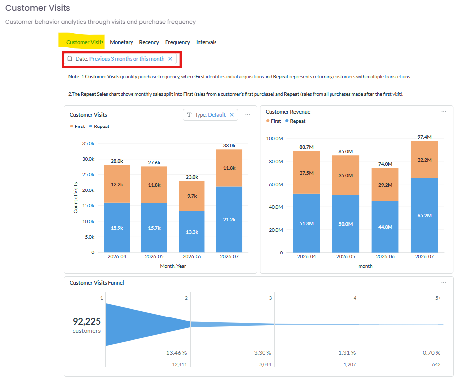
This section quantifies purchase frequency by splitting your data into two categories: First (initial acquisitions) and Repeat (returning customers with multiple transactions).
-
Date Filter: Use the date selector at the top left (e.g., Previous 3 months or this month) to isolate specific timeframes.
-
Customer Visits & Revenue Charts: These stacked bar charts compare the volume and monetary value of First vs. Repeat customers month-over-month.
-
Customer Visits Funnel: This chart visualizes customer drop-off rates, showing exactly how many customers convert from their first visit to their second, third, fourth, and beyond.
2. Monetary Tab
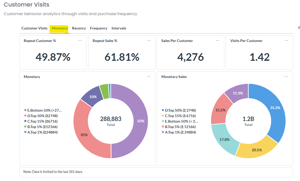
The Monetary tab breaks down the financial value of your customer base over the last 365 days.
-
Top KPIs: Instantly view high-level metrics across the top, including Repeat Customer %, Repeat Sales %, Sales Per Customer, and Visits Per Customer.
-
Monetary Segmentation: The pie charts segment your audience into spend brackets (e.g., Top 1%, Top 5%, Bottom 50%). This helps you easily identify what portion of your revenue comes from your highest spenders versus your general audience.
3. Recency Tab
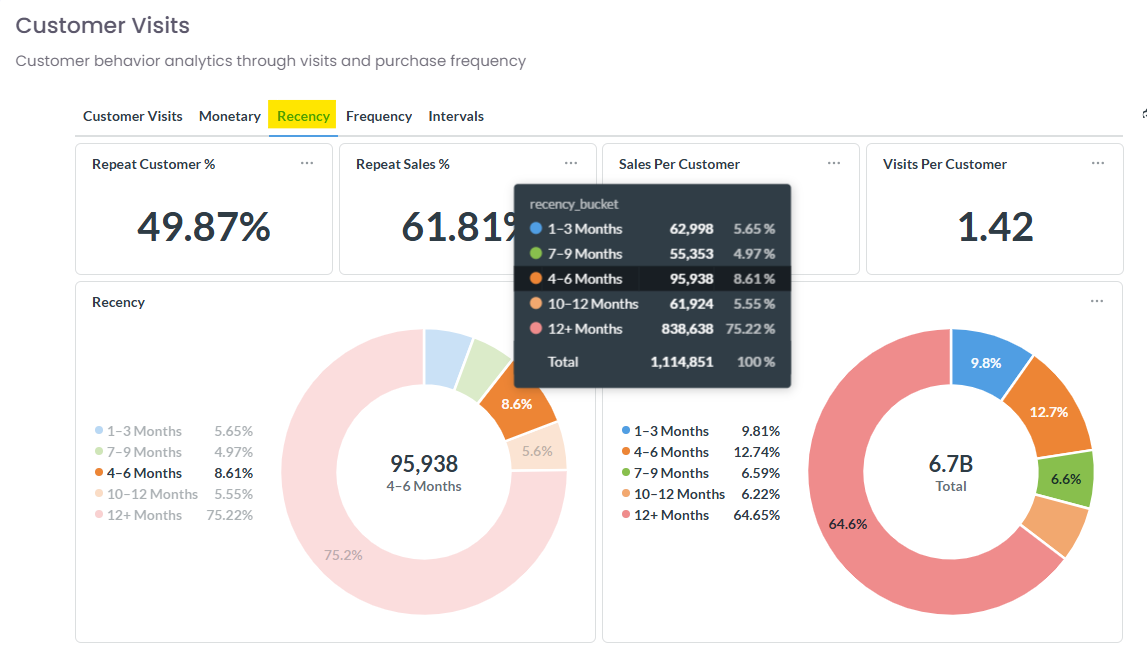
The Recency tab helps you understand how long it has been since your customers last made a purchase.
-
Recency Buckets: Hover over the pie charts to view detailed breakdowns of customer counts and total sales across specific timeframes (e.g., 1-3 Months, 4-6 Months, 12+ Months).
-
Insight: A large percentage in the "12+ Months" bucket indicates a high volume of dormant customers.
4. Frequency Tab
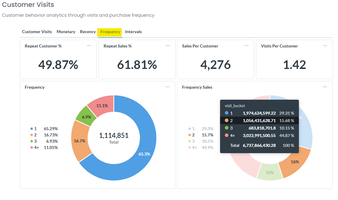
The Frequency tab illustrates customer loyalty by grouping shoppers by their total number of visits.
-
Visit Buckets: The charts categorize your audience into 1, 2, 3, or 4+ visits.
-
Insight: Compare the Frequency (customer count) chart against the Frequency Sales chart to see how much of your overall revenue is driven by your most loyal (4+ visits) shoppers.
5. Intervals Tab
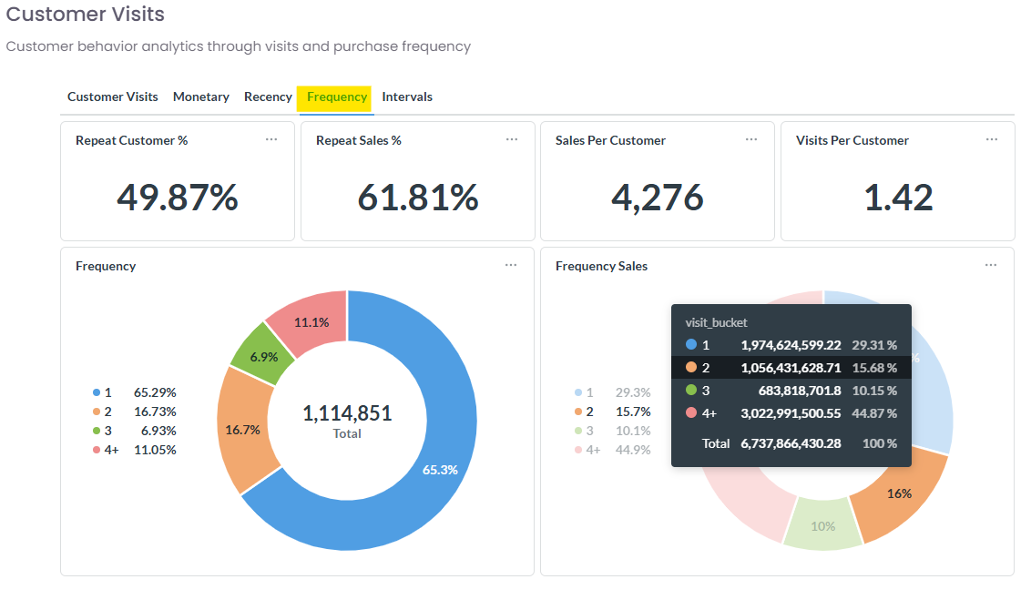
The Intervals tab tracks the average time that elapses between a customer's consecutive visits.
-
Interval Categories: The bar charts show the distribution of returning customers based on their return speed (e.g., Within 15 days, Between 1 and 2 months, Between 6 and 12 months).
-
Insight: This data is critical for timing your automated lifecycle campaigns, such as replenishment reminders or "we miss you" offers.